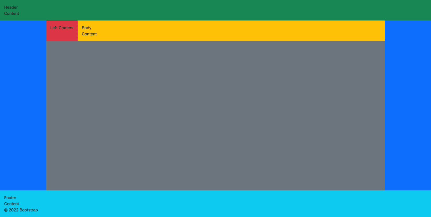
Creating breakpoint classes for classes that don't have media query ranges
Write SASS code to define classes like w-md-auto and fw-md-normal
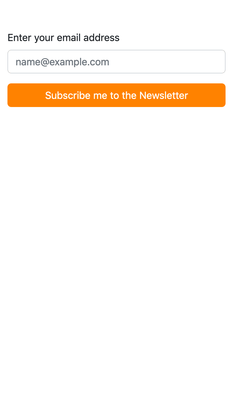
Let's say you wanted a button full width on mobile and regular width (auto) on desktop.
You think you would do :
<form>

    <div class="mb-3">
        <label for="exampleFormControlInput1" class="form-label">Enter your email address</label>
        <input type="email" class="form-control" id="exampleFormControlInput1" placeholder="name@example.com">
    </div>

    <div class="d-none d-md-block">
        <button type="button" class="btn btn-primary text-white px-5 d-block ms-auto me-auto ms-md-auto me-md-0">Subscribe me to the Newsletter</button>
    </div>

    <div class="d-block d-sm-none">
        <button type="button" class="btn btn-warning text-white px-5 d-block ms-auto me-auto ms-md-auto me-md-0 w-100">Subscribe me to the Newsletter</button>
    </div>

</form>
But this is duplicating HTML code just for the sake of responsiveness.
The regular CSS way is to define CSS for media queries for max-width:576px etc.
Bootstrap has a way to extend classes with custom attributes like color and style like the way I showed in this blog post where I also showed that certain bootstrap classes like text-center for all screens and text-md-start for left-alignment on medium sized screens and above thereby making it text-center for mobile devices only.
Now, you can also define breakpoints to existing classes which don't have breakpoint names in bootstrap.
For example : what if you want a button on a form with full width (w-100) on mobile screens and not full width (w-auto) on desktops ? There is no way we can do w-100 w-md-auto because there isn't a breakpoint for width to do w-md-auto. But we can create them and it's relatively simple.
We add this SASS code after @import "utilities";
$utilities: map-merge(
  $utilities, (
    "width": map-merge(
      map-get($utilities, "width"),
      ( responsive: true ),
    ),
  )
);
So the final instajobs.scss file will look like this :
$primary: #ff8200;

$instajobs-colors: (
    "ij-main": #00ac9f,
);

@import "functions";
@import "variables";

$theme-colors: map-merge($theme-colors, $instajobs-colors);

@import "maps";
@import "mixins";
@import "utilities";

$utilities: map-merge(
  $utilities, (
    "width": map-merge(
      map-get($utilities, "width"),
      ( responsive: true ),
    ),
  )
);

$utilities: map-merge(
  $utilities, (
    "height": map-merge(
      map-get($utilities, "height"),
      ( responsive: true ),
    ),
  )
);

@import "bootstrap";
Build it : sass scss/instajobs.scss css/instajobs.css
Now you can add it like :
<button type="button" class="btn btn-primary text-white px-5 d-block ms-auto me-auto ms-md-auto me-md-0 w-100 w-md-auto">Subscribe me to the Newsletter</button>
Reference : https://getbootstrap.com/docs/5.2/layout/breakpoints/